I. Introduction
Central in the debate in this year’s presidential election is whether government provision of new benefits and additional tax breaks to the rich will in the end also help the not-so-rich. Mitt Romney, himself a good representative of those who have become extremely rich through finance, as well as other Republicans, argue that the rich must be helped and given further tax breaks as they are the “job creators” who in the end help us all. The alternative view is that at best the help to the rich will be kept by the rich, and whatever goes to the rich (whether through additional government provided benefits to the rich, or through how the economy itself benefits the rich) will come dollar for dollar from what would otherwise go to the not-so-rich, thus worsening their position.
This blog posting will examine evidence behind this issue, through a look at long-term growth in the US (going back to 1870), and how this growth has been distributed between the rich and the not-so-rich (for the period we have data, from 1917). It will find that long-run growth (growth in economic capacity) has been remarkably constant since 1870, which calls into question whether government policies have had much of an effect one way or the other on growth over the long term.
But it will also find that how this growth is distributed among income groups has changed markedly over time. Growth was equitable from World War II (following the reforms of the New Deal era) until 1980, with all income groups (rich and not-so-rich) benefiting similarly. But this changed markedly after about 1980, following the measures deemed the “Reagan Revolution”. Since 1980, the rich have become much richer indeed, while the bottom 90% of households have seen their real incomes stagnate or even decline.
II. The Growth in GDP per Capita in the US
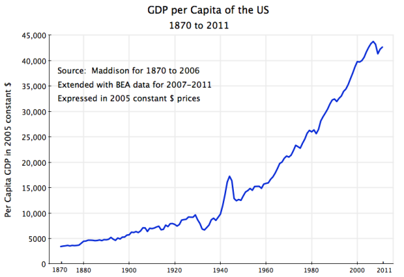
We start with a look at the growth of per capita GDP in the United States, going back to 1870:
The numbers are principally from data put together by the late Angus Maddison, who in his career at the OECD and elsewhere assembled a remarkable set of data on growth over the long term of not only the US, but also of much of the rest of the world. The Maddison numbers were extended to cover 2007 to 2011 based on figures in the regular GDP accounts of the US issued by the BEA in the US Department of Commerce.
The figure shows the growth of US per capita GDP from about $3,500 in 1870 (in terms of 2005 prices) to $43,000 today. By way of comparison, China’s GDP per capita is currently about $4,800 (in 2005 prices), which is about where the US was in the late 1880s.
While there have been some fluctuations (notably in the downturn in the 1930s during the Great Depression, and then the spike in the early 1940s during World War II), it is difficult to see in a figure such as this whether growth in recent decades has been faster or slower or the same as in earlier periods. But this can be easily seen if the numbers are converted into their logarithmic equivalent. In logarithms, a constant rate of growth will be a straight line; an increasing rate of growth will be seen as a line bending upwards; while a decreasing rate of growth will be seen as a line bending downwards. If you are not familiar with logarithms, you can either take my word for this or consult your high school math textbook.
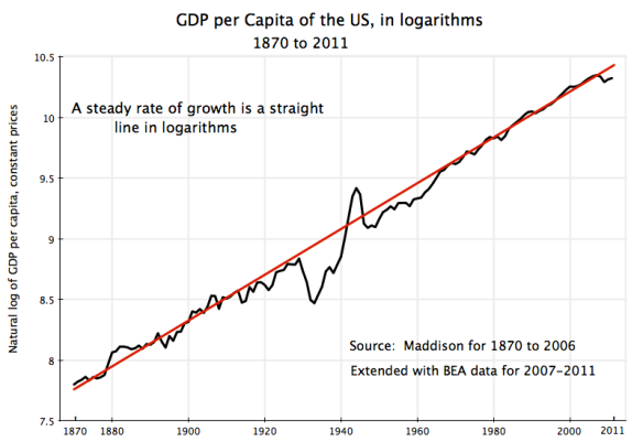
Converting the GDP per capita numbers into their logarithmic equivalent (these are in 1990 prices, which Maddison had used, but the base year for this does not matter), one finds:
The red line drawn through this is a straight line, indicating a steady rate of growth of per capita GDP over this 141 year period (at a rate of 1.9% per year, or 1.869% per year to be more precise). This is remarkable. REMARKABLE! There are significant year to year variations, and sometimes decade long variations (such as in the 1930s during the Great Depression, and the spike during World War II). But eventually, even after the shocks of the Great Depression and of World War II, the economy has always returned to the same path it had been on before, not to a different one.
The path can perhaps best be interpreted as the growth in productive capacity when all resources, and in particular all labor resources, are being fully employed. This capacity limit for the economy grows over time based on growth in technology and in the skills applied in using that technology as well as in using labor and other resources. And for some reason we do not understand, the rate of growth on that path has been the same for over 140 years.
It is remarkable that that rate of growth in productive capacity was the same in the closing decades of the 20th century as it was in the closing decades of the 19th century, and in the connecting periods in between. That is, the rate of growth in the age of steam and rail in the latter 1800s, or growth in the age of microchips and information in recent decades, and everything in between, has always been the same.
This finding should be rather disconcerting to economists. Hardly a week goes by that a book is not published which says that the key to faster growth is to do … (with each saying something different). Yet the steady pace of long-term growth at 1.9% per capita a year suggests that for a developed country like the US, operating close to what technology allows in terms of overall production, growth in capacity will be little affected by less regulation or by more regulation, by more investment in education or by less investment in education, by more spending on research and development or by less spending on research and development, and so on. All of these have varied greatly over time. But the long-run rate of growth has not.
To be fair, merely showing such constancy in long-run growth does not prove anything. It is possible that policies have varied over time in such a way that changes which would have raised the long-run rate of growth were offset by policies that reduced the long-run rate of growth by the same amount. This is possible, but it would be an amazing coincidence if there were always such exact offsets.
What is fair to say is that the reasons behind this long-term constancy in the rate of growth are not well understood, and that economists, politicians, and others should be modest when they advocate one policy or another.
III. The Distribution of the Income Produced by That Growth
While there has been constancy in the growth of average per capita income, this does not mean that different income groups have necessarily shared equally in that growth. But while such distributional data are not assembled in the regular national income (GDP) accounts, Thomas Piketty and Emmanuel Saez (as part of a larger international effort) have assembled such data based on US income tax returns. The concept of income is not exactly the same. GDP measures the value of all production in any specific year (which ultimately accrues to someone), while tax returns report on taxable household incomes in any year, including realized capital gains but not items such as unrealized capital gains. But over long periods of time they will move similarly. By using US income tax return data, Piketty and Saez are able to arrive at estimates going back to 1917 (and 1913 for some of the data, the year the modern US Income Tax system began). And by using tax return data, Piketty and Saez are able to arrive at accurate figures on the incomes of the very rich (including the top 1%, top 0.1% and top 0.01%), which survey based methods cannot cover well as the numbers in such groups will be relatively small in any broad-based sample.
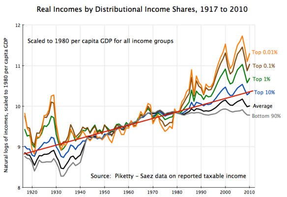
Using the Piketty-Saez data, one can arrive at the following:
This is an unconventional presentation, as the aim is to focus on how real per capita (actually per tax unit, which is normally a household) distributional shares have varied against each other over time. In this presentation, the incomes (in logarithms) are presented relative to what they were in 1980. The 1980 figures could have all been set equal to 100. But to facilitate comparison with the figure above on average GDP per capita (in logarithms), the scale is set to average per capita GDP in 1980. To state this point again: All incomes were not equal in 1980. The top 0.01% earned far more than the bottom 90%. But to show the changes relative to 1980 as the base year, all incomes were scaled to the same number in 1980 (which could have been anything, such as 100, but which in this case was set to the log of per capita GDP in 1980).
Several things are clear in this figure. First, the very rich (top 1% and higher) did very well in the 1920s, even though the bottom 90% saw their incomes stagnate. The “Roaring 20s” were not a boom for everyone. But everyone then saw their incomes collapse with the on-set of the Great Depression in the 1930s, with only a slow and partial recovery during the decade until the largest fiscal stimulus program in history (spending in World War II) was implemented in the early 1940s.
Then, from the middle of World War II to 1980, the incomes of all of the groups rose by similar proportions (with each of the groups enjoying an increase in real incomes of about 80% per household), with only limited differences between the groups. This was a period of not only growth, but equitable growth.
Things then changed in the early 1980s. While overall growth continued (although perhaps at a somewhat slower rate, depending on the precise dates chosen), all of the benefits of this growth was accruing to the rich (the top 1%) and especially the very rich (the top 0.1%, and the top 0.01% even more so). The bottom 90% saw their incomes stagnate, or even decline depending on the year chosen for comparison.
Note that there is no mathematical reason leading to the top 0.01% seeing their incomes necessarily grow by more than the top 0.1%, who in turn saw their incomes grow by more than the top 1%, and so on. The figure shows the proportional changes in the real incomes in these different groups defined relative to what they were in 1980, and one can see in the diagram periods in the past where the top 0.01% fared worse than the top 0.1%, for example. It is only since 1980 that one sees this non-overlapping stratification, with the incomes of the absolute richest increasing by more than the incomes of the very rich, with these increasing by more than the incomes of the moderately rich, and so on down the scale. The changes in the economy since 1980, whether due to Reagan or for other reasons, not only benefited the rich, but benefited the absolute richest the most of all.
But what is true mathematically is that if the average per capita income is growing at some rate as it has historically, as it appears to have since 1870, then a higher share going to the rich and especially the very rich must be matched by a lower share going to the not-so-rich. This is then not a story where helping the rich will help us all, but rather a story that what goes to the rich must be coming from the not-so-rich. And that, unfortunately, seems to be consistent with the data depicted above, where the rich have done very well since 1980, while the bottom 90% have seen their real incomes stagnate and indeed decline to below 1980 levels following the 2008 collapse.
IV. The Changes in the Real Incomes of the Different Groups Since 1980
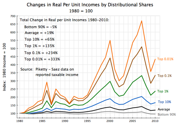
The proportional changes in the incomes of the different groups in absolute values (not logarithms) since 1980 has been as follows:
The rich have done very well since the 1980s and the start of the “Reagan Revolution”. Even following the 2008 economic and financial collapse in the last year of the Bush Administration, the top 0.01% in 2010 earned 333% more in real terms than what they earned in 1980. The average income of those in the top 0.01% bracket in 2010 was $23.8 million. And they were doing much better in 2007 before the 2008 economic collapse, when their income was 570% above what it had been in 1980 in real terms, and they earned an average of $36.9 million (in prices of 2010) each.
In contrast to the rich, the bottom 90% have seen their incomes stagnate since 1980. In 2010, their income was 5% below what it was in 1980. They were doing modestly better during the Clinton years, and their real incomes peaked at 11% above their 1980 level in 2000. But their incomes then fell, to only 3% higher in 2003 than in 1980, recovered a bit to 9% higher in 2007, but then fell again in the 2008 collapse.
Note also that it really is the super-rich who have benefited in this post-Reagan economic system. Even the top 10% saw their incomes grow by only 65% over the thirty years from 1980 to 2010. Thirty years of growth at the long-term rate for US per capita GDP of 1.9% would have led to a 76% increase in their real incomes. And the top 10% includes the top 1% (and richer), whose huge income increases will raise the average for the top 10%. Excluding the top 1%, the real incomes of the remaining 9% (i.e., those with incomes between the 90th and 99th percentiles) rose by only 35% over this thirty year period.
V. Summary and Conclusion
In summary:
a) The long-run rate of growth in the US has been remarkably stable since 1870, at 1.9% a year. It has maintained this rate from the age of steam and rail, to the current age of microchips and information. Economists have no good explanation of this, which suggests a good deal of skepticism is warranted when economists, politicians, or others suggest they know the secret to how to raise the rate of long-term growth.
b) In contrast to this stable rate of long-term growth, the pattern of how this growth has been distributed across the population has varied a good deal, at least back to 1917 (the earliest year for which we have complete data). Distribution worsened in the 1920s and became less unequal only with the start of the massive stimulus program of World War II. Then from the middle of that war to 1980, the economy grew with both the rich and the not-so-rich sharing similarly in growth.
c) This then changed after 1980, with massive growth in real incomes for the very rich, while the bottom 90% saw their incomes stagnate or get worse.
The Republican policies launched by Reagan of low taxes on the rich plus financial and other deregulation were justified on the basis of the assertion that they would lead the economy to grow faster, and that all income groups would benefit from this. There is no evidence in the data that this has occurred. Growth has not accelerated. If anything, growth has decelerated, although this could still reflect a downswing from which the economy could eventually recover as it did following the 1930s. The rich have nonetheless gotten very rich since 1980, while the bottom 90% have suffered. The data suggest that the Reagan policies have not acted to accelerate growth for all, but rather have acted to transfer the gains that there were to the rich from those in not so advantageous a position.
Given how Mitt Romney himself has benefited from this Reagan program, it should not be surprising that not only does he support it, but that he wants to extend it even further. But it is not clear why those not in his super-rich class should agree.
_______________________________________________________________________
Update – April 19, 2013
A reader of this blog has asked me a very good question through the Contact Me form. As others may have a similar question, I thought it best to try to provide an answer here, for all to see.
The question raised was that in the final graph shown on the blog (titled “Changes in Real Per Unit Incomes by Distributional Shares”), average real income per unit is reported to have risen by only 19% between 1980 and 2010. Yet if real GDP per capita had grown at the long term trend of 1.9% per year over this period, real GDP per capita would have increased by 76%. Why the big difference?
The difference is indeed very large. One would not normally expect such a divergence. But there are several reasons for this. I had noted one in the original posting, but there are others as well.
In the original post I noted that the Piketty-Saez data, based on incomes reported on tax returns, will differ from incomes as reported in the GDP accounts as they are measuring different concepts of income. The GDP accounts measure the value of all production in any given year. While that income will eventually accrue to someone, it will differ from incomes reported by households on their annual tax returns. A major part of income in the GDP accounts, for example, will first be earned by corporate entities. While corporations do pay a portion of this in dividends to their owners, a portion is retained and not immediately paid out. The portions can vary over time. And household taxable income includes not only what is currently earned in wages or received in dividends, but also capital gains that are realized through the purchase and sale of assets. Such capital gains are not part of the GDP accounts, as they do not reflect the value of current production.
But there are other reasons as well for the difference. Specifically:
- First, while growth at the trend rate of 1.9% per year would have led to a rise in real GDP per capita of 76% over 30 years, the actual GDP per capita growth over 1980 to 2010 was 65%. Due to the 2008 downturn, from which there has been only a partial recovery, GDP in 2010 was about 6% below the capacity level of GDP in that year. One can see in the graph above of GDP per capita in logarithms how the actual per capita GDP fell below the trend from 2008. And while all economists expect the economy to recover eventually, it is not known how long this will take (it will depend on policy).
- The change in real GDP is determined using the GDP deflator for the price index. The GDP deflator is based on the prices of all goods that make up GDP, which includes not only the goods that households consume, but also investment goods as well as the prices of imports and exports. Piketty-Saez, in contrast, are focused on household real incomes, and therefore have used the Consumer Price Index (CPI) as their price deflator. The two price indices differed markedly over the 1980 to 2010 time period: the GDP deflator rose by 32% while the CPI used by Piketty-Saez rose by 52%. Had GDP per capita been deflated by the CPI rather than the GDP deflator, measured real per capita GDP would have risen by 43% instead of 65%.
- Real GDP per capita is based on the whole US population, while the Piketty-Saez data is based on reporting tax units. Tax units are generally households. Over the 1980 to 2010 period, the number of households rose at a faster pace than population, as the average household size fell (fewer children as well as more households reflecting a single adult). Over 1980 to 2010, population rose by 36% while the number of tax units (households) rose by 57%. Adjusting for this, real per unit GDP (based on the CPI, as per above) would have risen by 25% based on the number of tax units rather than 43% based on population.
- The final difference between this 25% increase and the 19% increase in real per unit average incomes reported in the Piketty-Saez data can be accounted for by the differences in definition between taxable household income and GDP.


You must be logged in to post a comment.